1. Finding the inspiration
A Blade Runner World
This website is the result of weeks of work mostly inspired by brutalism aesthetics, preceded by months of
conversations on the influence of social media on our daily lives. Looking back, it must have started on the
multiple business trips to China
and Taiwan with my friend Josh. Shanghai at night, after the rain has drained away the skies, the landscape of
the city seems to be taken straight out of the dark and neon sceneries of Blade Runner.
Both liking the
cyperpunk genre, which interestingly
emerges from punk subculture and early hacker culture of the 80s, we questioned on several occasions our
interaction with technologies. Concerns that are very much generational. We grew up with cell phones, saw the
rise of social media and online
dating which eventually led to a metrics-centric youth, well aware of their personal brand image. Millennials,
as we are often referred to, have had their social norms disrupted by the internet in a world in which capital
and real estate benefit
the older generations.
Internet used to be much different. Even though everything seems to move faster these days, we can still recall the first video games, the sound of the modem, the silly drawings on paint or the gifs we would send out to a growing community of online friends. There was a sense of constant wonder and optimism that haloed computers then.
How could we draw in these carefree moments of the early age of the internet and computers to find inspiration for a simple, friendly and more fun web interaction?
Playing around with low poly design
Nostalgia is a very powerful tool. It washes the details of the past and brings up memories of happy times. For our generation saturated with social media, it would be the first ipod, myspace, Nitendo characters... It might well explain why gifs, pixel art or even skeuomorphism have gained momentum in the recent years on the web. Being sensible to this form of art, I have been wandering around, browsing the internet, finding inspiration for wiridis branding in websites, codepen or dribble.
At the end of summer 2019, I quit my job and made this side project that was wiridis a real business. The blur
ambition was to start a custom data product development company. With Mathis, we had been working on a fully
integrated time management
and burn out prevention app for almost a year and a half.
Well before the coronavirus crisis, I had few
requests for web design, SEO and digital strategy for hospitality businesses. Soon enough, happy to take on
consulting projects while working
on product development, I had to focus my time on making revenue. Mathis would work on the application, I would
build the consulting side of wiridis. With the reorientation of the company, we needed a new message and a new
look.
During the Christmas holidays in Paris, I experimented with low poly design using libraries such as z-dog.js.
It is very lightweight, easy to learn and interactive. Z-dog helps you create pseudo-3D shapes for canvas and
SVG. My interest for webGL and Three.js grew as I could see some very well designed examples on awwwards.
The
first illustration I intended to add to wiridis website was a lighthouse. The lighthouse guides
through ominous waters, it shines a light on the right path to follow. Memories of a childhood sailing on the
north coast of Brittany.
See the Pen Zdog - Lighthouse illustration by Thomas (@thomas_wiridis) on CodePen.
The symbolism of transformation: from 2D to 3D
Early January 2020, I took a trip to Dublin to visit Josh and his wife Lauren who moved there few months prior, trading a sunny Singapore for a more celtic weather, grumpy hawker aunties for warm Irish hospitality. Every morning saw Lauren and I walking the windy streets in search for a cafe to work from. It was not an easy task, surprisingly enough. Eventually, we found what we were looking for: stable wifi, great coffee and wholesome chocolate brownie. It was a cosy narrow shop house with wooden floor and dark green walls on the other side of the river from the emigration museum. We were set up to (re)define the identity and symbolism of wiridis. Lauren is an amazing 3D artist, I was in the best of company for this endeavour.
The vision for wiridis has always been the same. Be the friendly interface between data and decision making. Be
the agent that would guide people and businesses to incite meaningful actions. As the French author Nicolas
Boileau said, "what is clearly
thought out is clearly expressed" or as the business saying puts it "what gets measured gets done". So what is
complex, wiridis will find ingenious, elegant, effective manner to explain and implement it.
Always in these
moments, I take out
my notebook. The same notebook, I carry on with me every breakfast at the kopitiam on Joo Chiat or on every bike
rides along East Coast Park. You never know when you stumble an idea that is worth noting down.
First I scribbled all the words that flashed across my mind, arranging the idea of transformation, phase
transtioning and interface. Quickly I drew a sphere floating besides a sheet of paper. As the globe would go
through, it would be somehow transformed
to reveal another shape. I placed them in a loop. It was like a circle of life. The ouroboros is an ancient
symbol depicting a snake eating its own tail. I drew a hatching snake.
After several sketches of blobs,
circles and snakes transitioning,
I drew the wiridis name next to the horizontal sheet. From there, chart lines and data points would morph into
the w to form the whole name. I had something. A good starting point. I soon moved on to design the web page
with the concept of shapes
piercing through an horizontal sheet. I envisioned something similar to newday agency's website and their
scrolling effect.
Somehow it made me recall a Pizza Hut's The Phantom Menace toy I own.
A Vader/Anakin hollow cube with a double-sided mirror fitted diagonally. Affixed to the left-hand side of of the
mirror was half of Darth Vader’s head, whilst affixed to the opposite side was half of Anakin Skywalker’s head.
Glancing at
one side of the cube you would see the full head of the character by reflection.
This toy was really nicely
engineered. It amazes me to see how one can play with optics in such an efficient manner. When science becomes
magical. Optics, reflection
and 3D. The nature of light. Old physics classes on Maxwell's and Young's equations bounced in my head.
Wavelength, ray through glass materials, MRI... I tried out different things until both Lauren and I locked the
concept: 2D transitioning to
3D, from meaningless figures to authentic reality. We could move on to the next step!
Drafting of the logo and landing page
Following our discussions and our multiple drafts on wiridis new identity, Lauren worked her magic. She had the
hard task to translate our handwriting into artful visuals. Meanwhile, I went back to my notebook and drafted
the landing page. I worked
on the overall layout, on ideas for the illustrations and the scroll bar. At the time, the main conception for
the site to display a split screen as an expression of the duality we had conceived. If you think about it,
split screens are quite
usual. We often see content and illustrations on each side of a web page. It likely the most common design. Here
we wanted to go further, drawing some inspiration in the audacious traits of the brutalism current.
I wanted
the design to have
a touch of engineering to it. Beyond the fact that it was my studies, an engineer finds and implements solutions
to issues he or she faces. This mindset had to be a part of the site. The engineering paper could be the base
for the background.
As an engineer would draw charts on these blueprints, we would place the content onto it with, at first, two
split layout options:
- A page with a morphing animation as we scroll down as an illustration to the content.
- A fixed section on the left-hand side with clickable items to display the content in windows.
First page design draft
Some of the concepts were beyond my front end skills. I had to settle for something slightly more simple at first. 2D and 3D designs should co-exist in the page, since it is an analogy for the transition between complex data to actionable reality. Windows appeared on our early sketches. I opted to use a combination of skeuomorphism and simple line frames, borrowed from the French and Belgian comic books format, for the landing page.
It was mid-January when my trip to Dublin came to an end. I flew back to Paris with fond memories of playing board games with my friends, burgers from Busen, random talks in pubs filled with the sounds of flutes and guitars. Our brainstorming sessions, our creative work saw the consolidation of wiridis identity. Our logo was on the way to being complete and we had a first landing page design to work with. 2D elements morphing into 3D shapes symbolise wiridis's mission to translate the abstract into the tangible.
See the Pen wiridis - window website by Thomas (@thomas_wiridis) on CodePen.
Other sources to check out
During this whole process, we came across very interesting websites and resources that got us inspired. Since then the list has grown, we listed a few of them below!
- Polly Kole, with an e-commerce website that feels very much like Blade Runner
- Brutalismwebsites, a collection of websites
- Antidote, an email marketing agency
- Erik Bernacchi's's portfolio, that feels like a psychedelic desktop
- Art Night, in 2019 in London
- Hankjobenhavn, an e-commerce website that feels like a Google Sheet
- Poolside.fm, a desktop website with awesome tunes
- WorldWideWeb, the very first web browser from 1990 rebuild by a team at CERN
2. Finding the visuals and building the final design
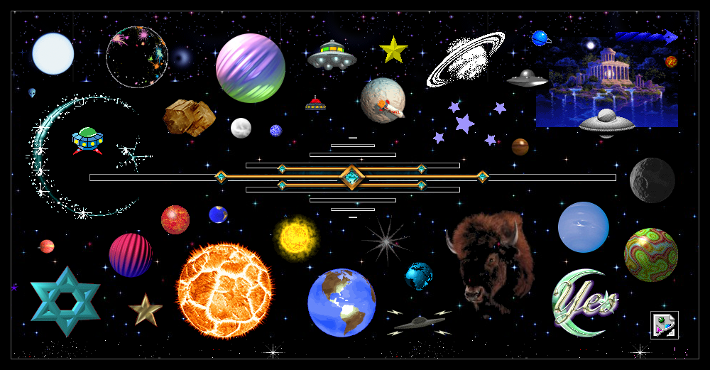
A cameron's world
Not being entirely satisfied with the front end, I continued browsing the internet in search for more
inspiration.
I must say it all came together when I stumbled upon Cameron's world website. I
spent a lot of time looking on the whimsical gifs and architecture of his site. Every time I would go back I
found something
new, a hidden pattern, a hidden pictures. The site was full of surprises. That is what I wanted for wiridis.
Wonders and discoveries. The whole vision of an older internet resurfaced.
Since we had envisionned static
windows, why not make them
draggable and recreate an old desktop as the website. A memory of an Instagram made for Windows 95 burst in my head. Following the
thread, I looked for any existing projects or libraries that could help out accelerate the development. A lot of
examples could be found such as this ui kit for Windows
95 made with Boostrap 4. My whole childhood we used Microsoft OS, it was then very tempting to use it for
wiridis. Yet I was appealed
to create something on my own and not rely entirely on someone else's design. Going on another direction, late
90s Apple and Linus OS offered the only possible alternatives. For no evident reasons I would go with Apple. The
hunt for macOS 8 and
9 assets could begin!
macOS archives and assets
Getting access to macOS archives was not too difficult. Besides, wikipedia and pinterest ressources, you will find several wonderful websites such with screenshots and archive assets.
The fun will come later to play with CSS to produce a replica of what existed at the time. The much harder part was to get desktop icons. It took a much longer time until I finally found GoldenWeb.it. This site was a pure gold mine for 8-bit icons. There was icons for food, from movies, mangas, video games, and obviously from all the 90s OS. To my greatest regret the site is no longer available. If anyone has found resources or know how to get a grip on the icons hosted on there, please do contact me! At the moment, I found a solid alternative in . Among my favourite artists there, check out:
Playing with the CSS
Once I gathered enough images and downloaded the first icons, it took me less than a week to finish the first
draft of desktop website for wiridis. The best part of this whole process was to mimic the screenshots and
transform the visuals into css
properties and an html structure. I took some liberties in the adaptation most of the time to favour readibility
or personal preference. Most of the time macOS 9 was the source of reference for the design but if one element
was interesting in
macOS 8, I would switch and use it as an inspiration.
For a more 8-bit feel to wiridis website, all pictures
are pixelated using image-rendering:pixelated;, while on the macOS 8 they had cleaner edges.
Desktop icons titles have
a dotted border with italic font style which is actually similar to what Windows had. Header titles and buttons
have a slight highlight using the property text-shadow: 2px 1px 0 #fff;.
Window headers are the
elements I had to change
the most from the original. Close and expand buttons seem to have blurred dark border on macOS that I changed
for a thinner cut. After discussing with several test users, I realised that the close button was not obvious. I
added a square in the
center of the it. Each header button reveal a color on hover. The apple red for close, the Atari green for
expand.
As things progress, I moved from styling one window, to working on a second one to ending up with of
five types: A white background,
a grey background, a left-side directory, a button header and a one inspired by Sherlock2 introduced on macOS 9.
You can see few of the original above. Of all the windows, styling Sherlock2-type was the most fun and the most
time consumming. The
selection button have a double inset box-shadow and a repeating background. After few attempts I came up with
something pretty close. The only thing I really could not get accurately was the window metalic background
pattern. I had to settle down
for a gradient background instead.
See the Pen wiridis - macOS desktop website elements by Thomas (@thomas_wiridis) on CodePen.
Working on the interactions with JS
If the css took less than a week between looking for archive and coding, the JavaScript tool much longer - partially because it was a fairly newer language to me. JS would help on making the desktop experience a whole. I had to find a library that could handle the drag and drop of the windows. I could write the close, expand and other interactions on my own.The two main challenges I saw were the following:
- The usage on mobile should be optimal.
- There should be no lag in dragging.
I tested three JS libraries before settling for Displace.JS.
The documentation is very clear, the library lightweight and the performance on mobile were the best among what
I had seen. Thanks to displace, each window has their absolute position updated relative to their container as
the user grab the header.
Once
the windows could be dragged from their header, the second challenge was on having the active window in front of
all the other open windows. I have seen a lot of similar website calculating the z-index property in CSS using
JS. Thinking this solution
was not optimal, instead we can append the active window in its parent container to benefit from the
z-index:auto; value. To avoid unwanted scrolling effect on open windows while manipulating their
position within the container with
the close function, the code checks if the window is not the last child before executing the append function.
3. Easter eggs and hidden features
If you have explored the website in details, you should have found almost all the hidden features or Easter eggs I have planted there. Among them, a Figrin D'an icon that leads you to wiridis' soundcloud, our Mars office address, a page with an Hawaiian Hula girl, a customisable theme for each of our favourite places to eat in the world - mine being Singapore Kopitiam - or a button to here wiridis pronounced in Russian. Enjoy the hunt! (to be continued...)
4. What's next?
Working on games
It would not be a proper desktop experience without games and paint-like features on the site. Exploring the archives of the Internet, I found a long list of more than 6,700 MS-DOS games that you can play directly in your browser. I will find some inspiration there and come back with some game development for wiridis.
Working on illustrations and content
A big part of the work will now be on improving the content of the website. To this date, it is still long and
lack of clarity on the presentation of wiridis services and expertise. New illustrations should go along with
the simplication of the
content. If any illustrator out there reads this, I need you! There are a lot of cool stuff we can work on with
8-bit and pixel art.
Shoot me an email!